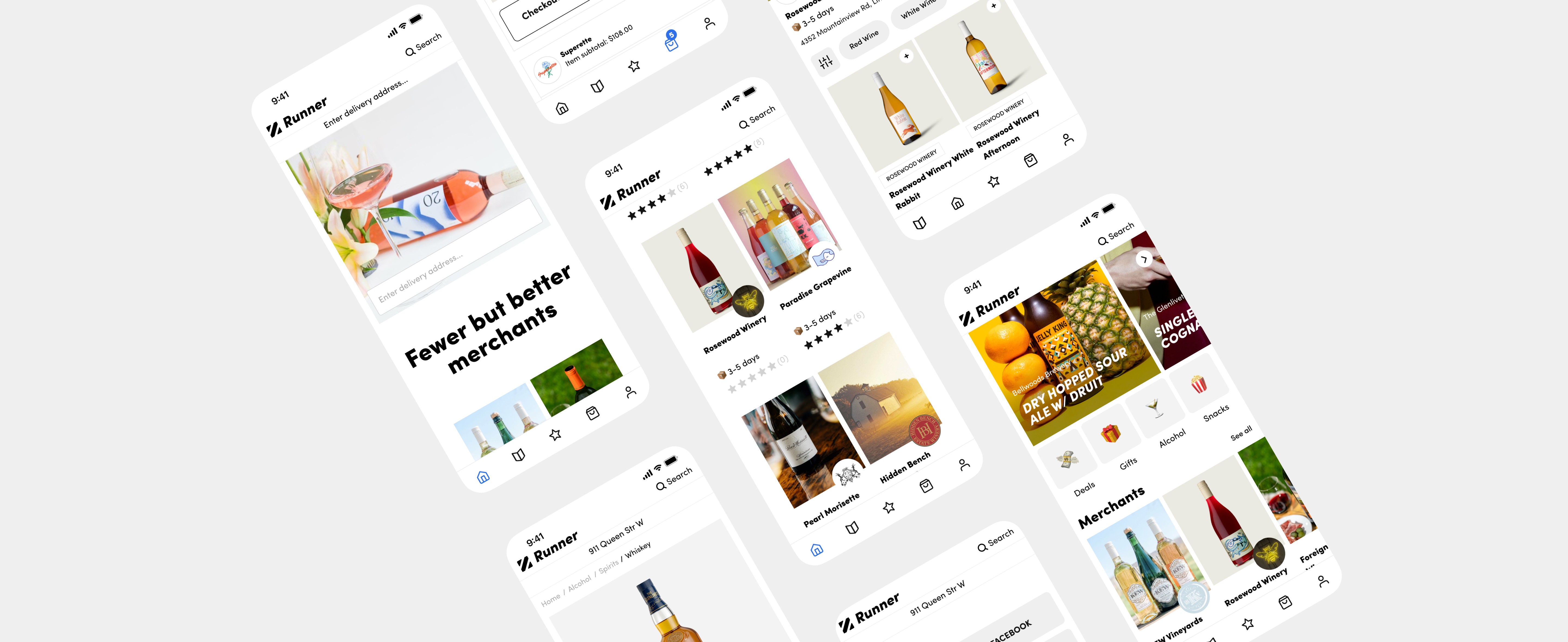
Runner Inc.
Runner Inc was one of the first curated convenience delivery service that was created to address the inconvenience of having to leave home and wait in long lines at the LCBO.
Skills
UX
UI
Photographer
Team
1 Designer
1 Product Manager
1 Software Developer
Timeline
2021 - 2022
Problem
When the pandemic hit, Runner saw an opportunity to expand it’s offerings to include snacks, gifts, food, and more, presenting only the best of each category. This diversification strategy attracted new customers and boosted profits. It was great!
However, there was also a high rate of shopping cart abandonment. Users frequently left their carts due to product unavailability in their area.
Goals
Increase curated product purchase.
Improve app infrastructure to make it easy to use.
Increase retention and conversion rate.
Limitations
x
Product limitations
Unreliable LCBO inventory – Inventory levels were not recorded in real-time
Products may be limited due to geographic location
x
Business limitations
Not enough physical storage – limiting the availability of non-LCBO products
x
Operation limitations
Delivering team not scaled to business demands – limiting the delivery in certain areas of the GTA
Researching findings
Similar to other delivery services, we needed to collect user's address upfront. This served two key purposes:
Product availability: Knowing the user's location allowed the app to display accurate product availability based on geographic restrictions or local inventory. This prevents user frustration from encountering out-of-stock items.
Delivery feasibility: The address helped determine if a courier was available in the user's area to complete the delivery. This ensured a smooth and efficient delivery process.
However, here’s what I found on our platform:
Landing page
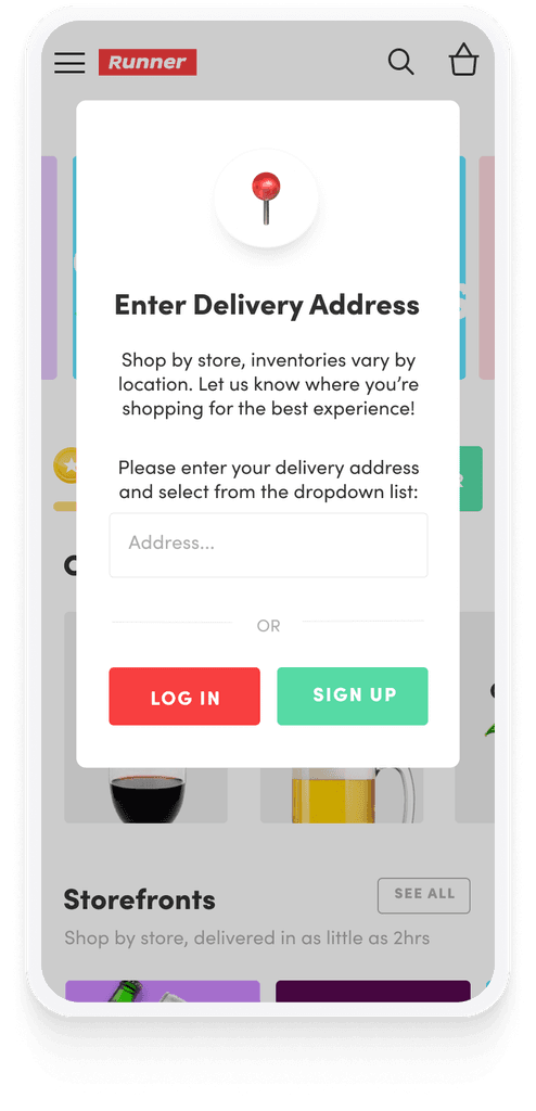
Intrusive pop-up: A fixed pop-up blocked product browsing, hindering product discovery.
Forced login: Requiring registration after entering the address felt like too many steps upfront.
Shopping by storefront experience
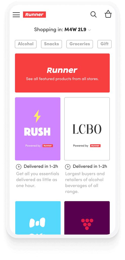
Confusing navigation: Browsing by individual storefronts proved unintuitive and led to user confusion. This hampered their ability to find desired items efficiently.
Mobile pain point: Navigation issues were more severe on mobile, highlighting the need for mobile-first optimization.
Shopping cart
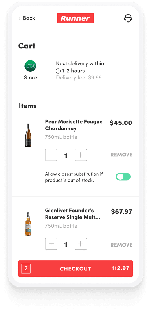
Limited shopping flexibility: Customers expressed frustration with being restricted to single-merchant purchases. Users wanted to mix items from different stores.
Cart disruption: Switching between storefronts caused shopping carts to be emptied, leading to user abandoned purchases.
Late night users
Confusing operation hours: Our operating hours extended until 10 pm, while LCBO closing times varied. This mismatch created confusion for users regarding alcohol availability for delivery after certain hours.
Solution
Through multiple rounds of iterations and learnings, we've explored many ways of navigating multi-vendors purchases within the app. And we've finally landed on our latest solution.
Streamlining purchase
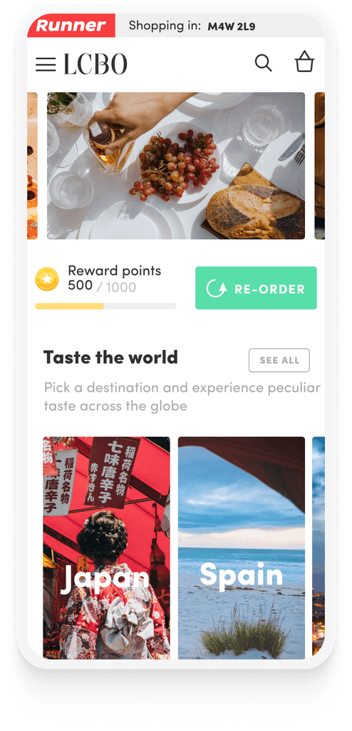
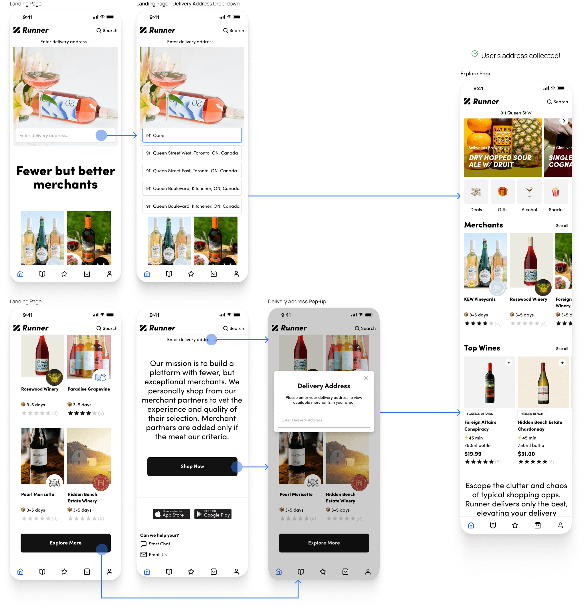
We recognized the importance of prioritizing browsing freedom, particularly for new users. With the new landing page, we made it easier for users to explore our service offerings and discover the available products in their area once they provided their delivery address. This empowered them to make informed decisions before committing (creating an account) to purchase.
Landing page at a glance

Landing page flow to collect user's address
Log in / sign up
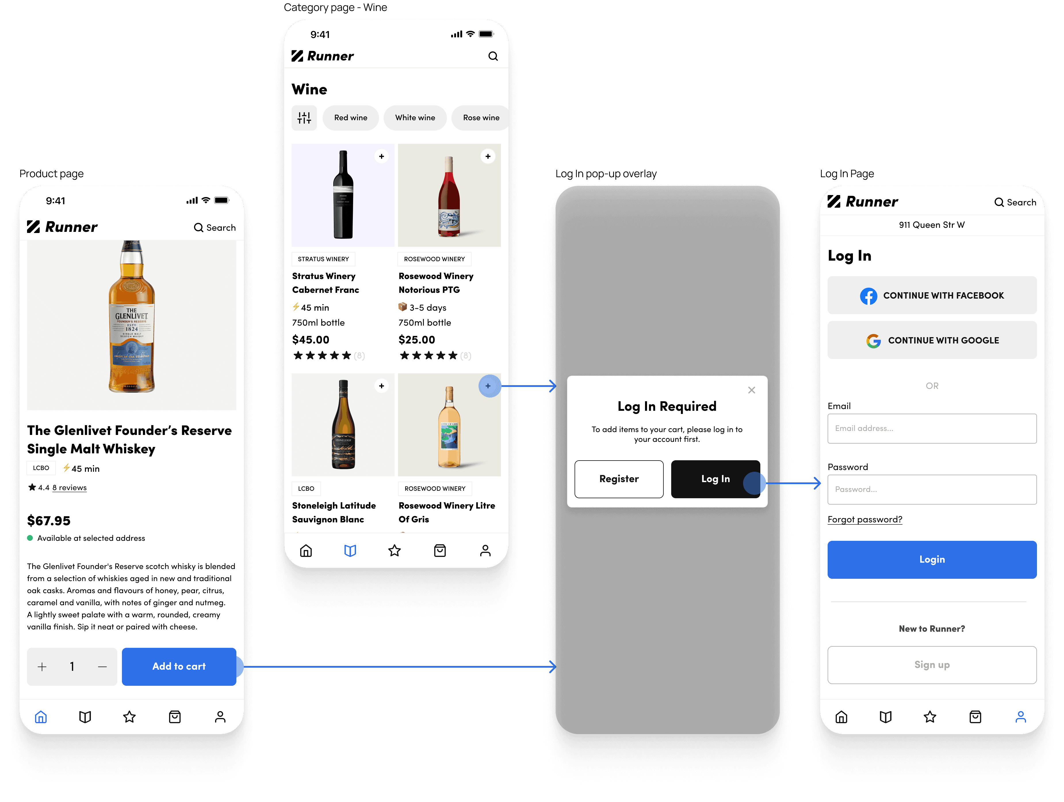
Discovering merchant products
In our previous findings, navigating by storefront was a confusing user experience. While we tried to contain users within a storefront to make it easier to checkout by merchant it limited the shopping experience. To address this, we deconstructed the navigation into smaller elements, enhancing merchant product visibility and user freedom.
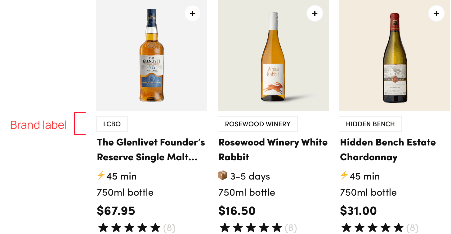
Product card labelling
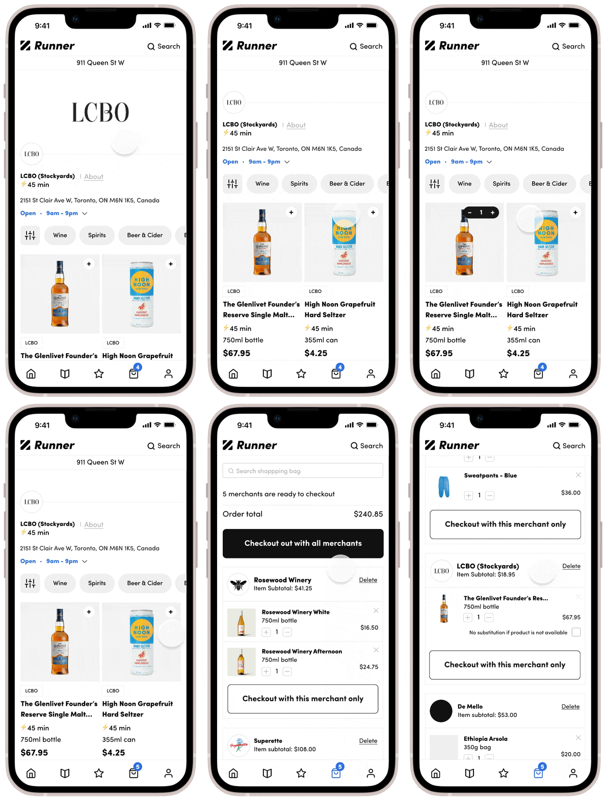
Product cards now display vendor brands, allowing users to easily identify who sells each item.
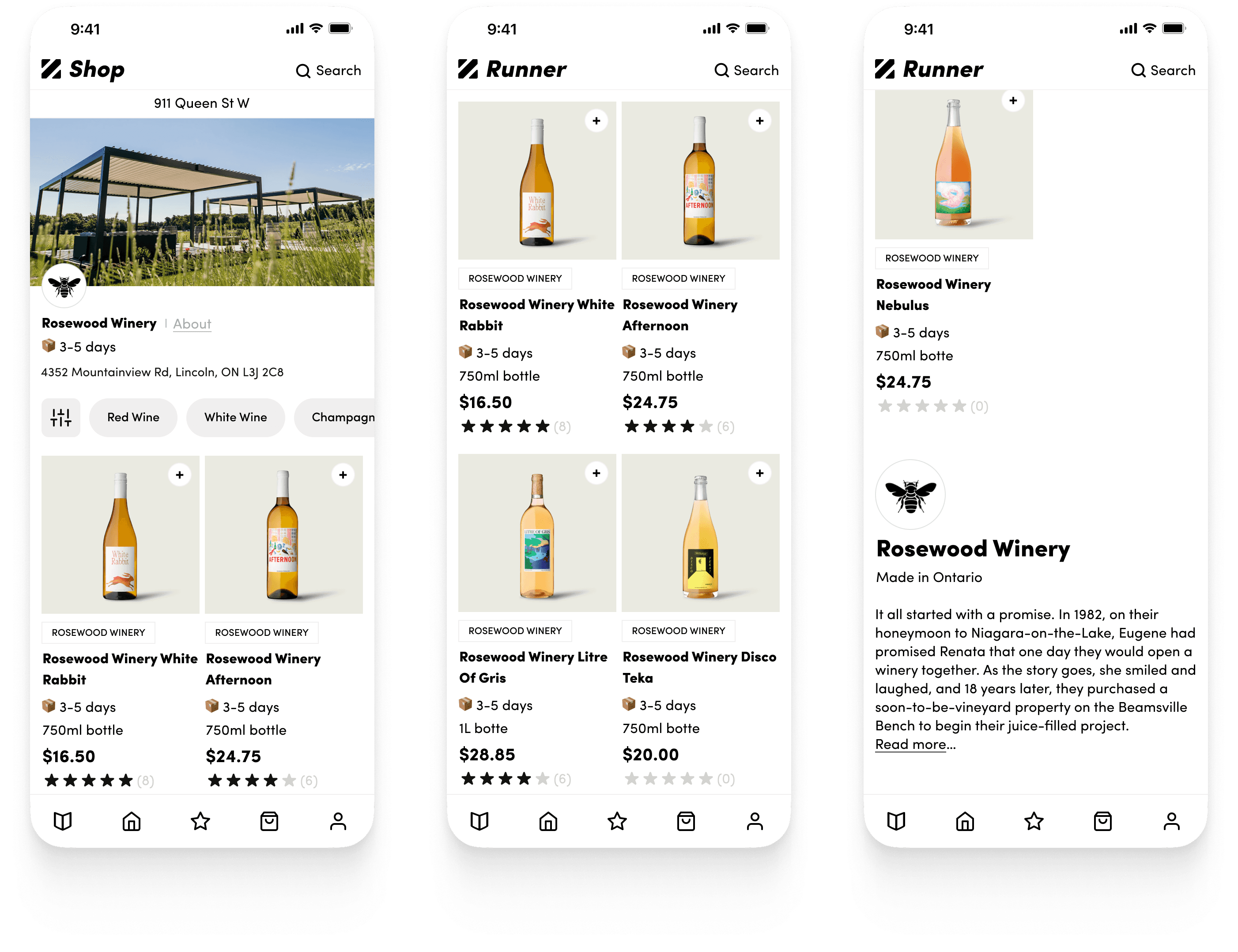
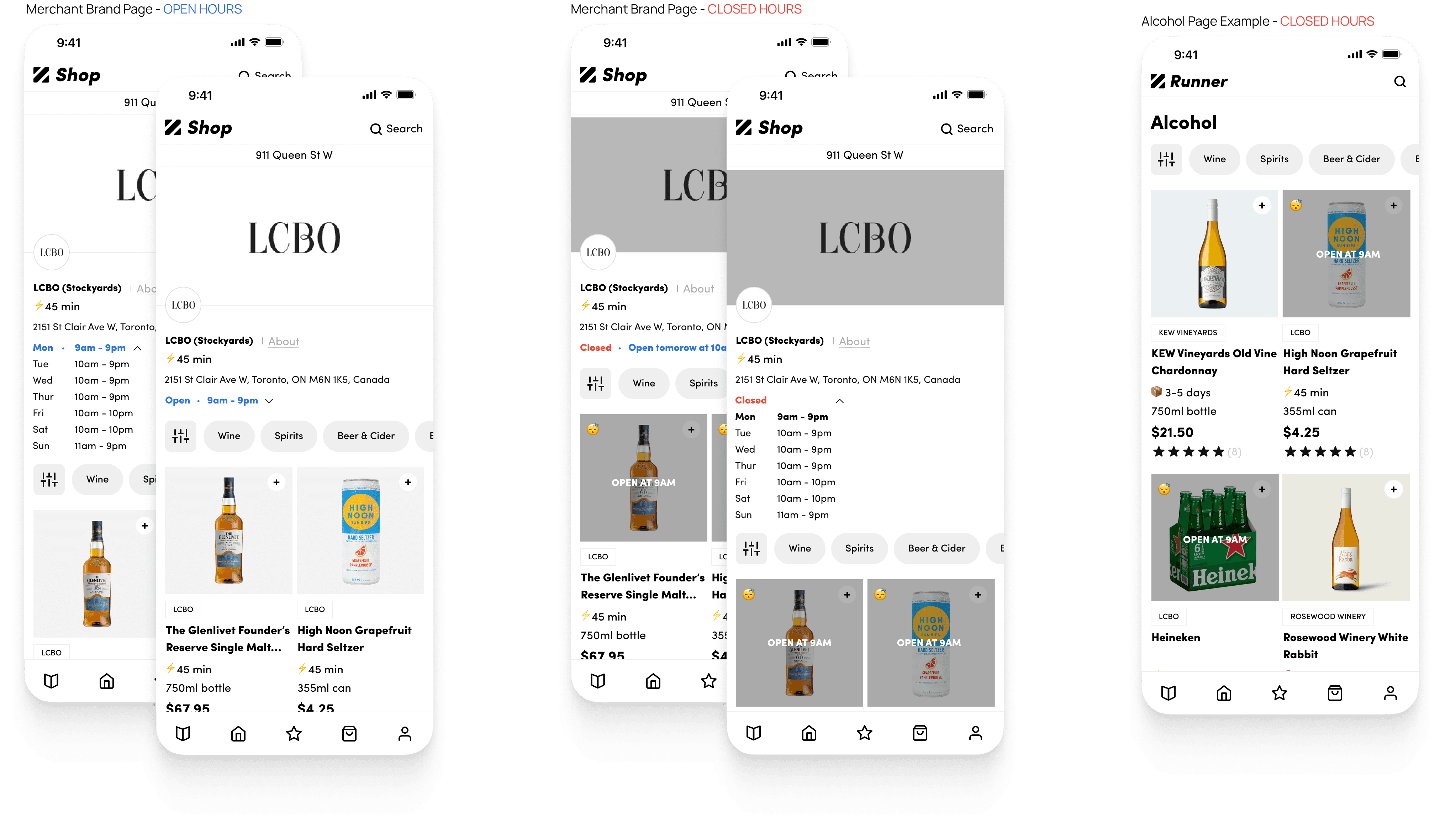
Dedicated merchant brand page
Next, a dedicated merchant page was created to provide users with information about the merchant's background and showcase their products. In addition, merchants were able to utilize this page as a referral link for their own promotional purposes.
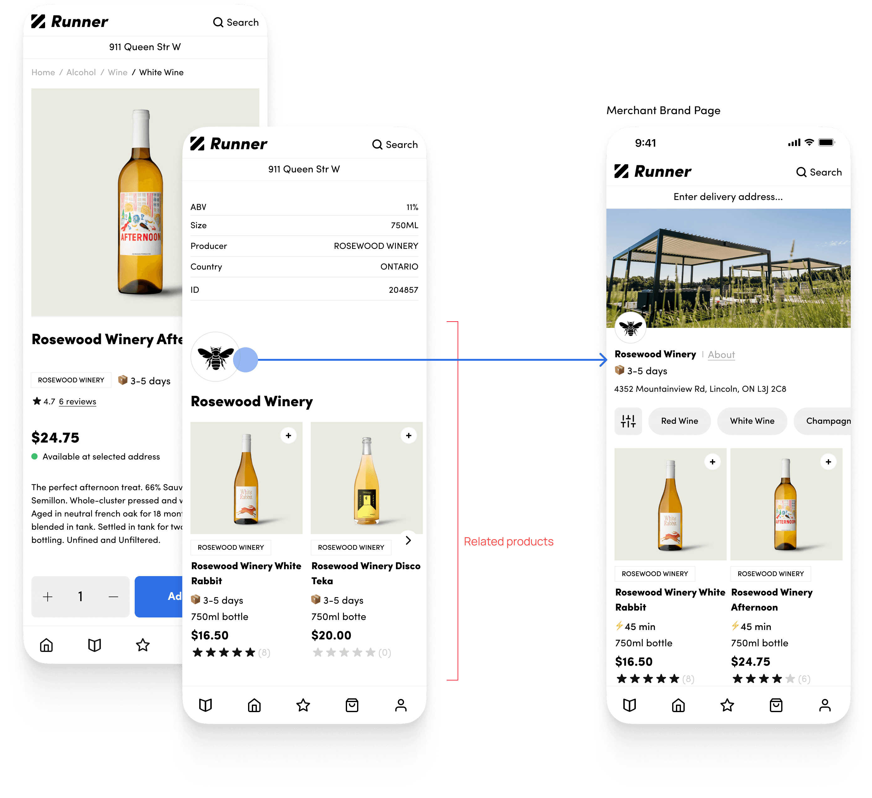
Increasing merchant's product discovery
Linked brand logos within product pages now empower users to seamlessly explore merchant offerings. This single tap fosters deeper discovery and brand exploration.
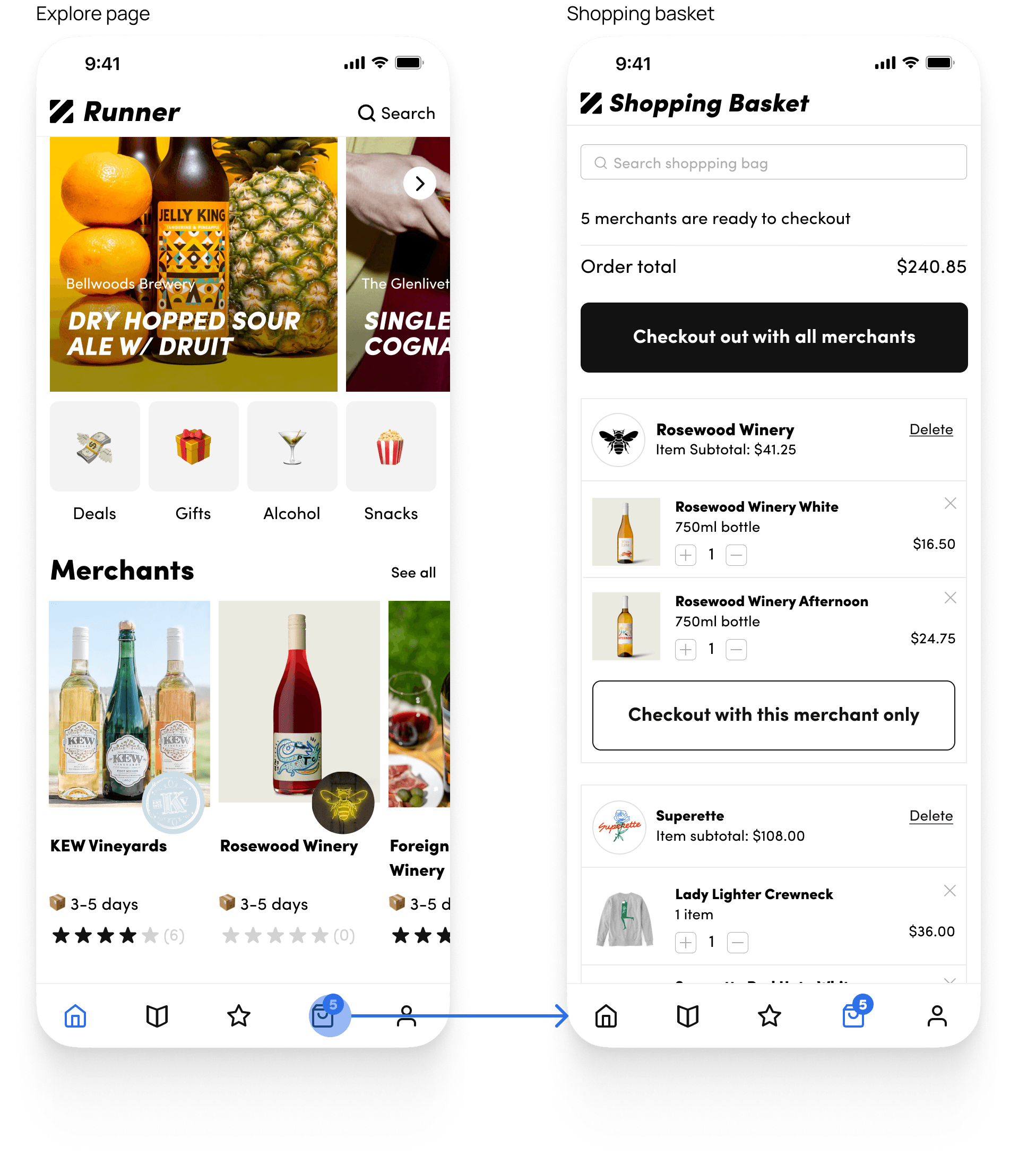
All in one shopping basket
With the new dual checkout experience, users can now effortlessly buy items from various merchants in one go, or easily pick specific items from their basket for a more focused purchase.
Store hours
As the curated list of merchants grew, different retail merchants meant different operating hours. To ensure users shopped efficiently, we made sure that the merchant's operation hours were displayed on the merchant's brand page.
Outcome
Our team worked hard on improving our product, and we were thrilled to see users spending more time exploring the platform as a result of our efforts. While product conversions have not experienced a significant increase yet from our newest design solution, the increased engagement was a promising sign and presented an opportunity for further optimization and improvement. In addition to this, we have been fortunate to build valuable business partnerships with returning customers.
Although I did not stay long enough to witness the full impact of our latest design release, I'm excited to have been part of this project and helped lay a strong foundation for future improvements and iterations on the platform.
Despite the growth of the company, Runner was unable to secure additional funds and began the new year of 2023 with a bittersweet goodbye. While the physical part of Runner was no longer there, the online presence and experience still remained.
