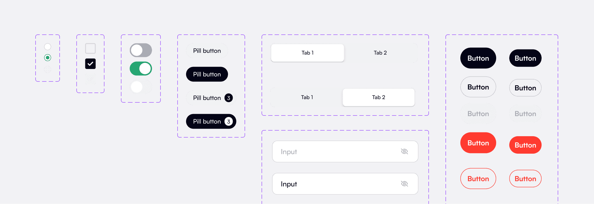
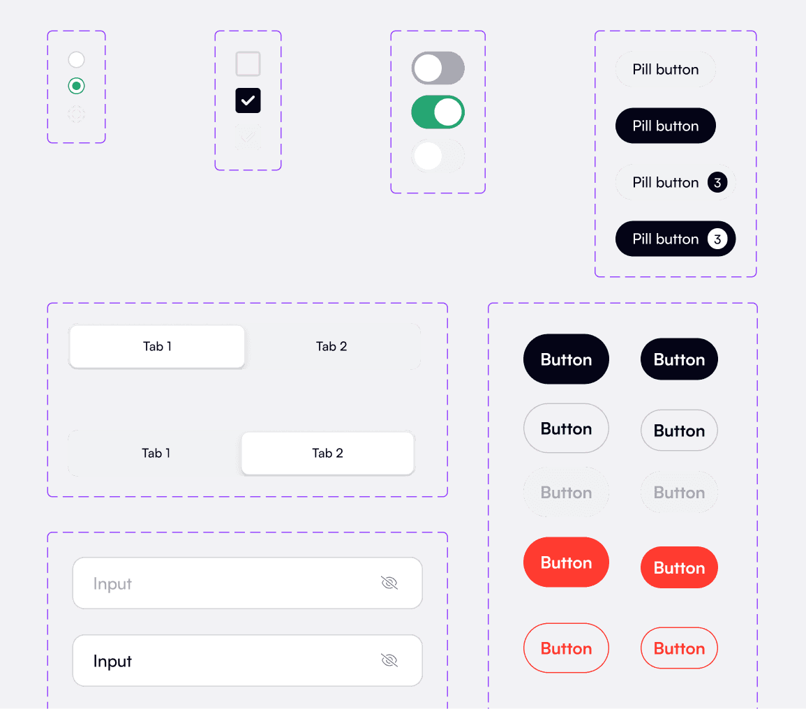
Borderless AI mobile design system
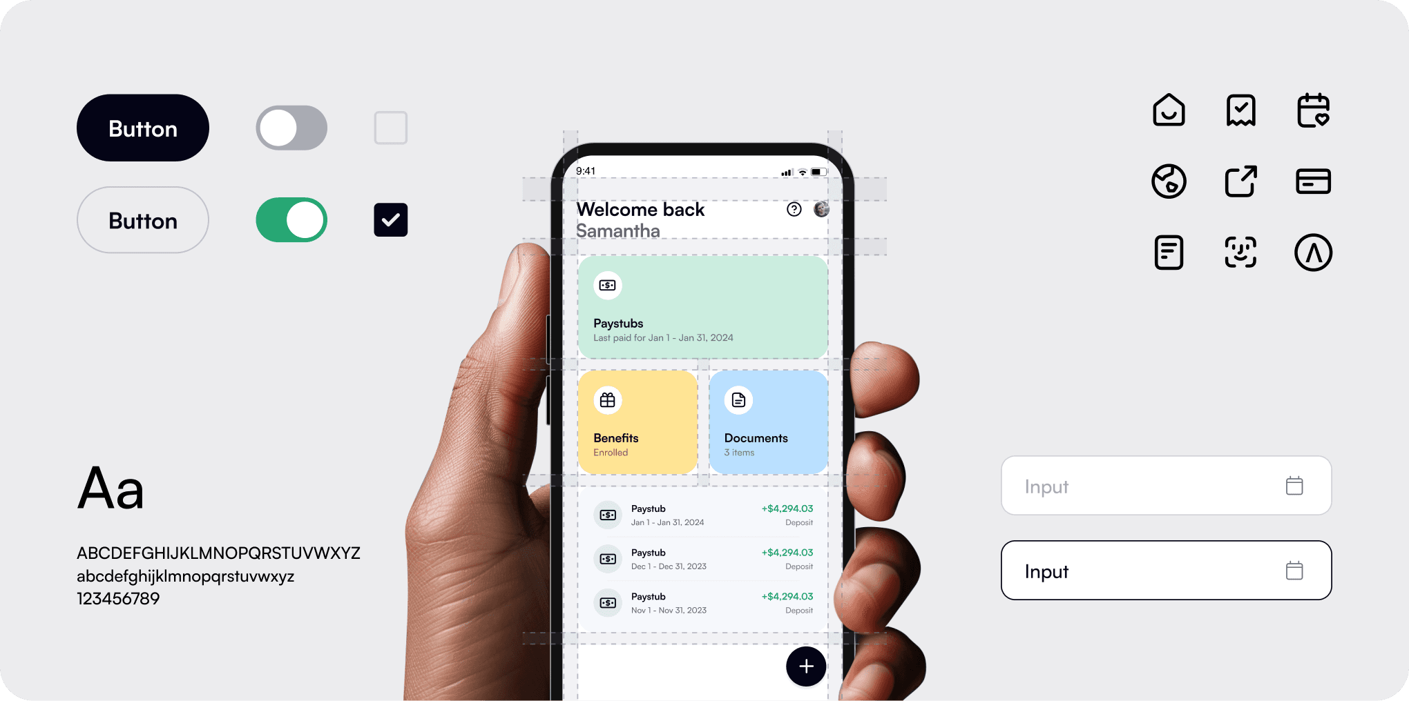
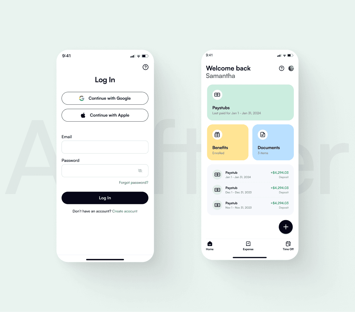
A full-on update and rebranding of Borderless AI’s mobile design system and platform that helped enhanced the user experience and strengthened the brand identity.
Team
1 Product Designer
1 Lead Mobile Engineer
Timeline
Sep 2023- Apr 2024
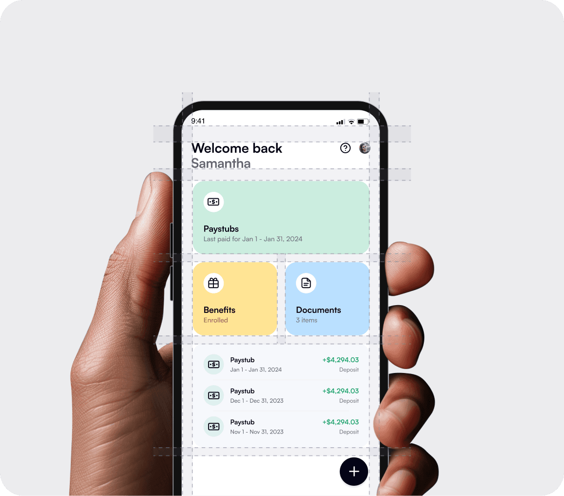
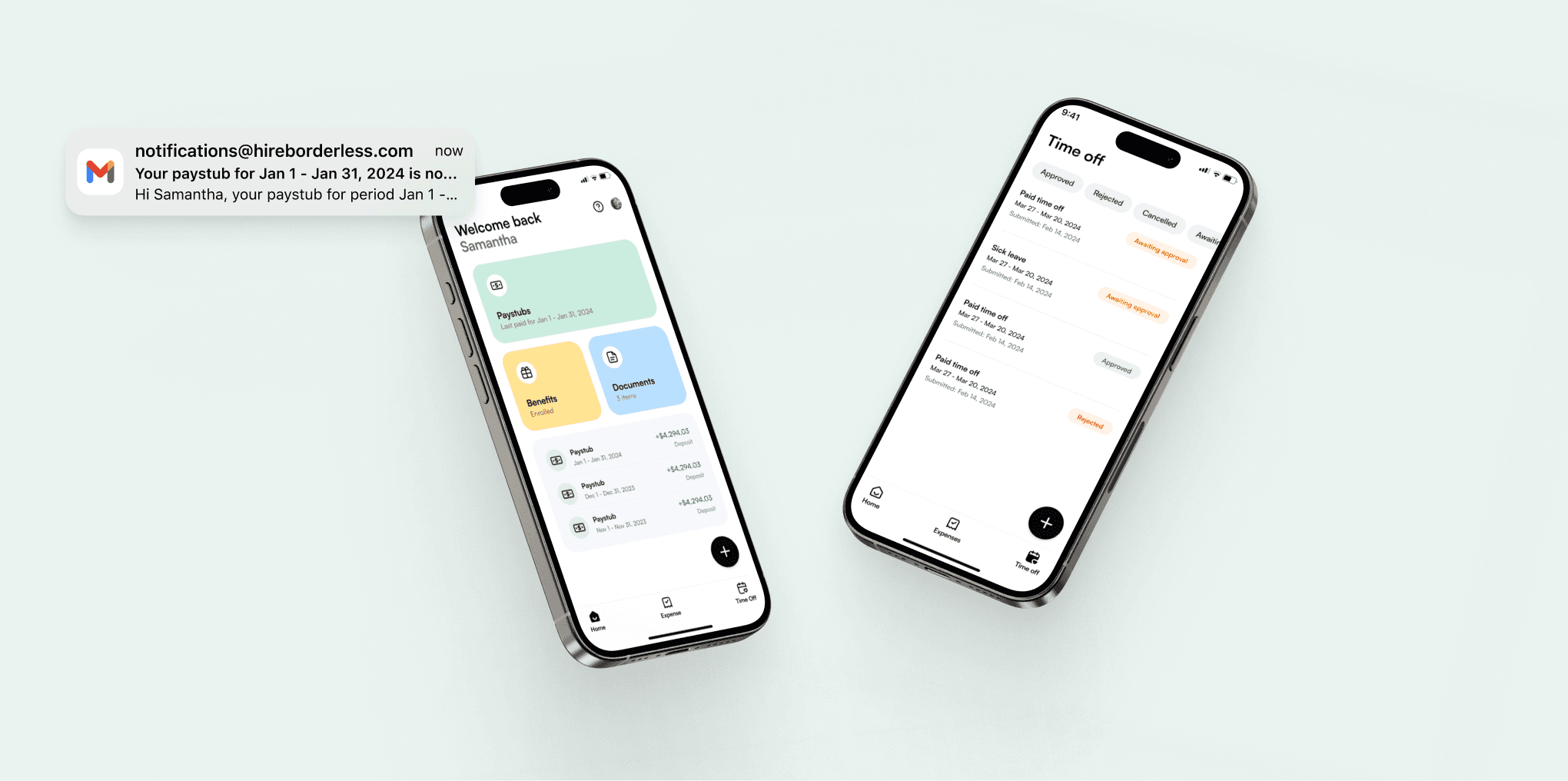
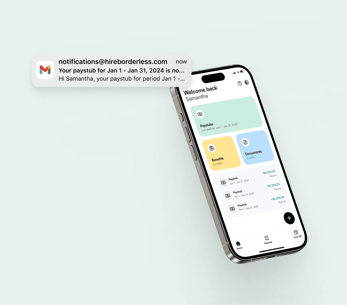
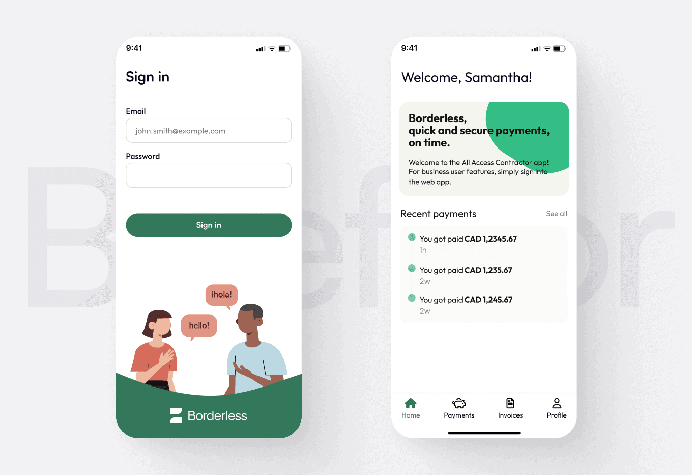
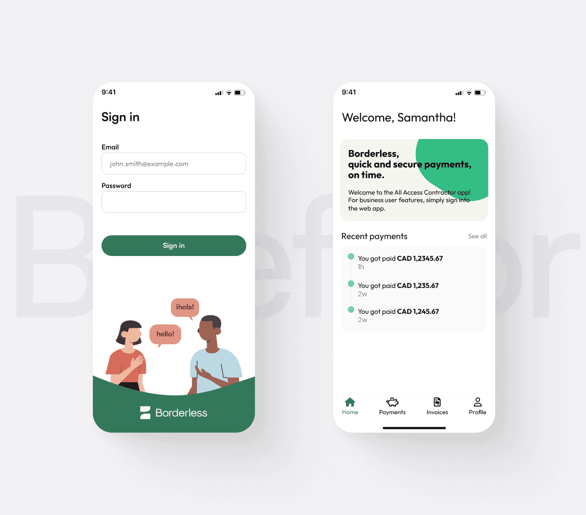
Borderless AI mobile app brings payment tracking to your fingertips and allows you to view the history and status of all your payments on the go.


As Borderless AI expanded into the Employment of Record (EOR) space, the mobile design system became disorganized, leading to both design and technical challenges. Without a consistent design system and with an incomplete brand refresh, the development process slowed down. This created confusion among team members and made it harder for designers to contribute efficiently.
How might we unify our design system to ensure a consistent and scalable mobile experience?
Streamline development and design process by providing a more structured and guided approach to building products.
Reduce design and UX inconsistencies to improve the overall user experience.
Improve brand perception and user trust through consistent experiences.
Launch a complete rebrand to align with the new brand refresh.
Findings
Through a series of collaborative sessions with the Lead Mobile Engineer, Piyush Sharma, we uncovered a few important key insights to ensure the mobile design system's success and scalability:
Colour theming inconsistency
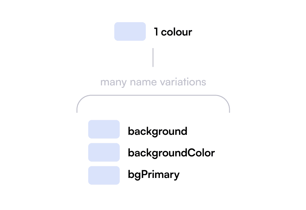
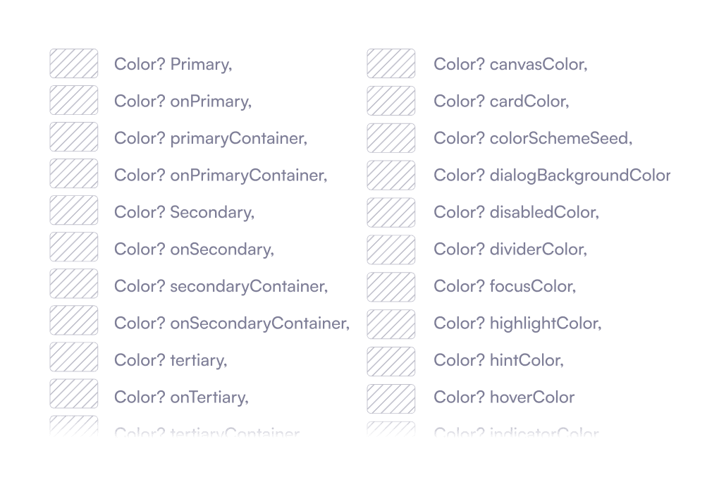
Inconsistent colour theming became a major issue as developers used custom colour codes instead of Flutter's built-in library, leading to a complex web of variations. This hindered efficient brand refreshes and required a complete colour overhaul across the app, that I had to set, to create a scalable and unified mobile design system.
This image is for illustrative purposes only and highlights the inconsistency of colour naming variations within the system.
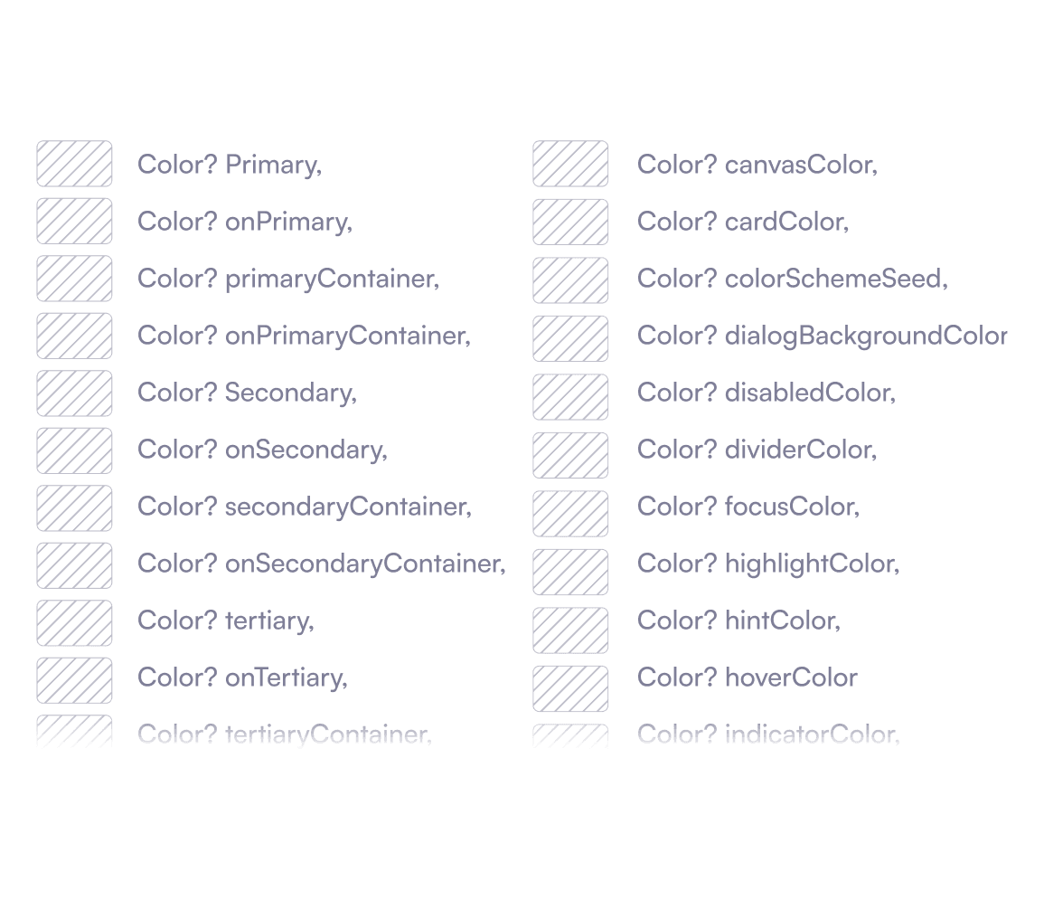
Gathered here is an example of the unused colour library from Flutter.
Disjointed experience
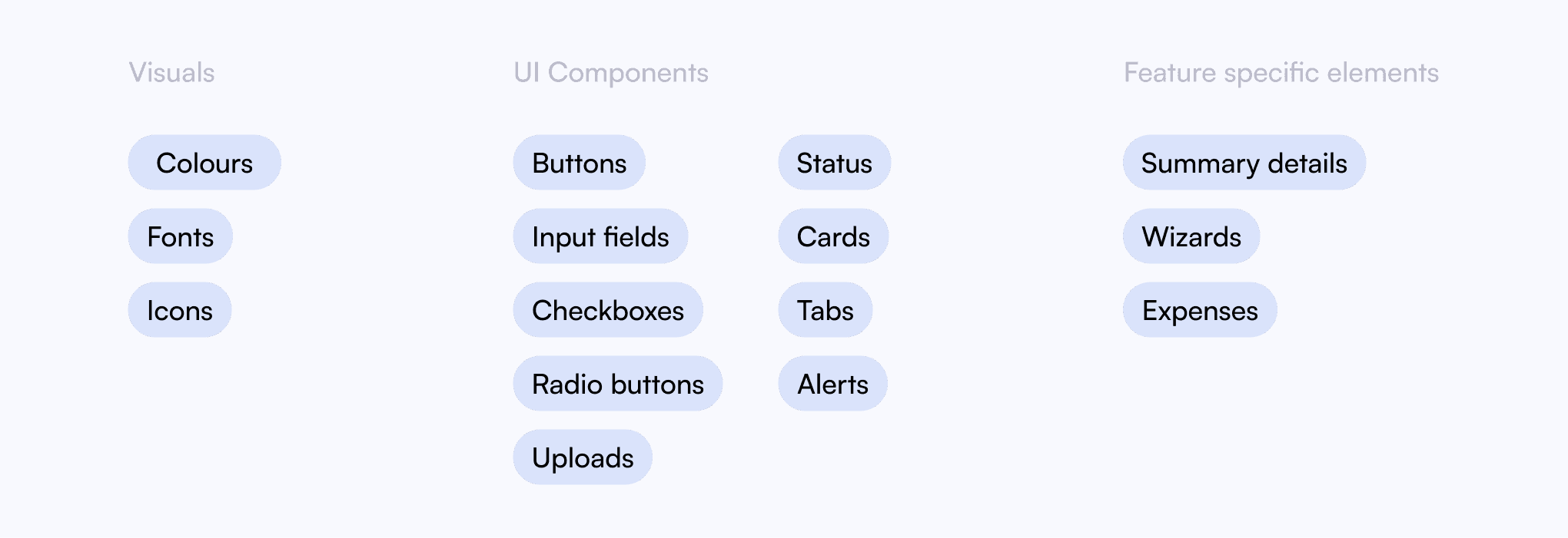
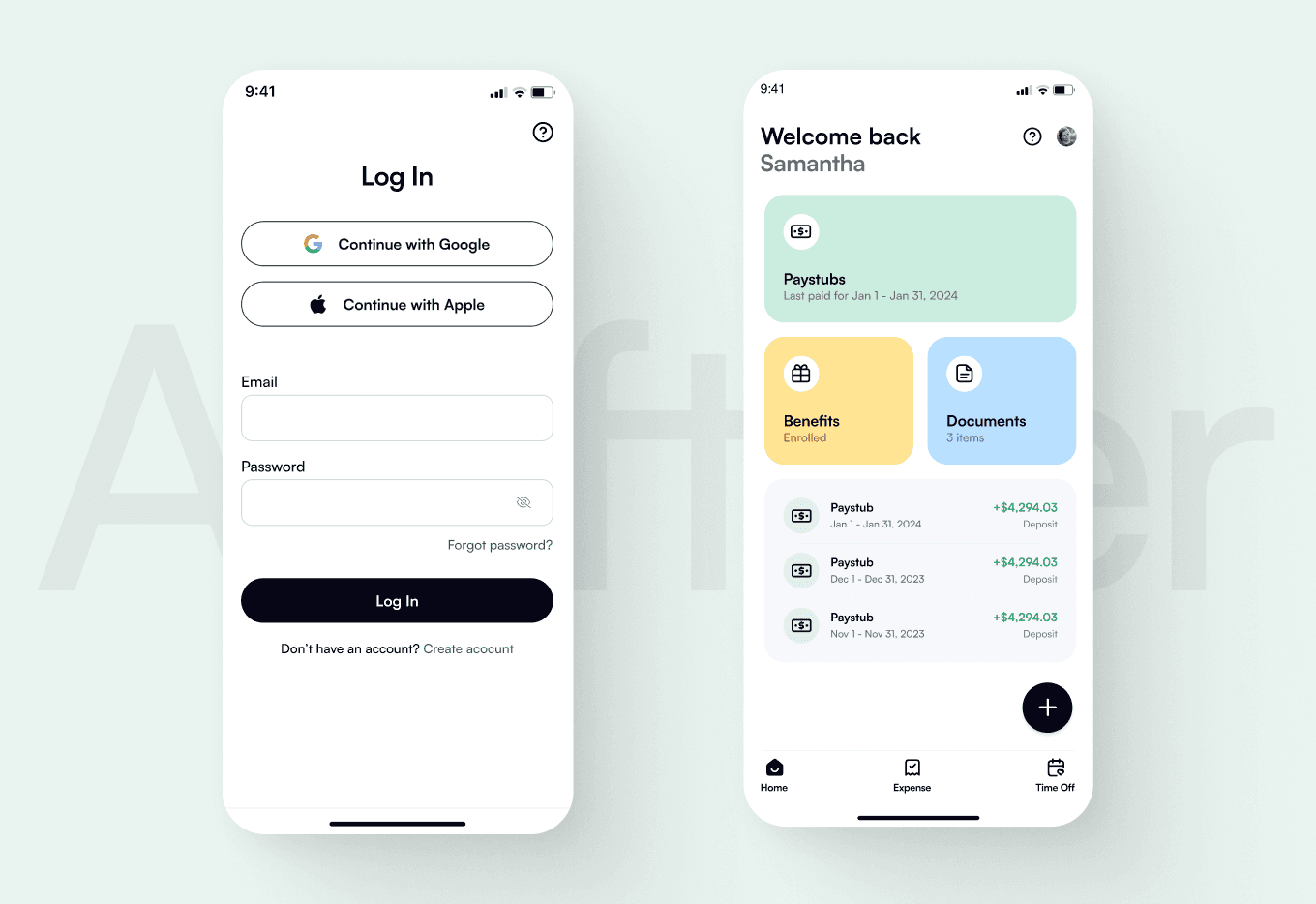
As new EOR features were rapidly developed to meet the complex needs of employees, the app began to deliver an inconsistent experience between employees and contractors. To create a scalable and cohesive product, a thorough audit of the app was conducted to identify the common and most ideal design patterns and elements across the app.
Deliverables prioritization & release strategy
Given that building the EOR and brand refresh was being built in parallel, our time and development capacity were limited. To make the process more manageable, we first prioritized updating the colour theme, as it was the quickest change to implement. Then, the team agreed to address one feature to fix per sprint, gradually completing and launching them to ensure a unified user experience.
The result of this journey was a consolidated single source of truth, an updated design system to streamline the design and future development of Borderless AI app.
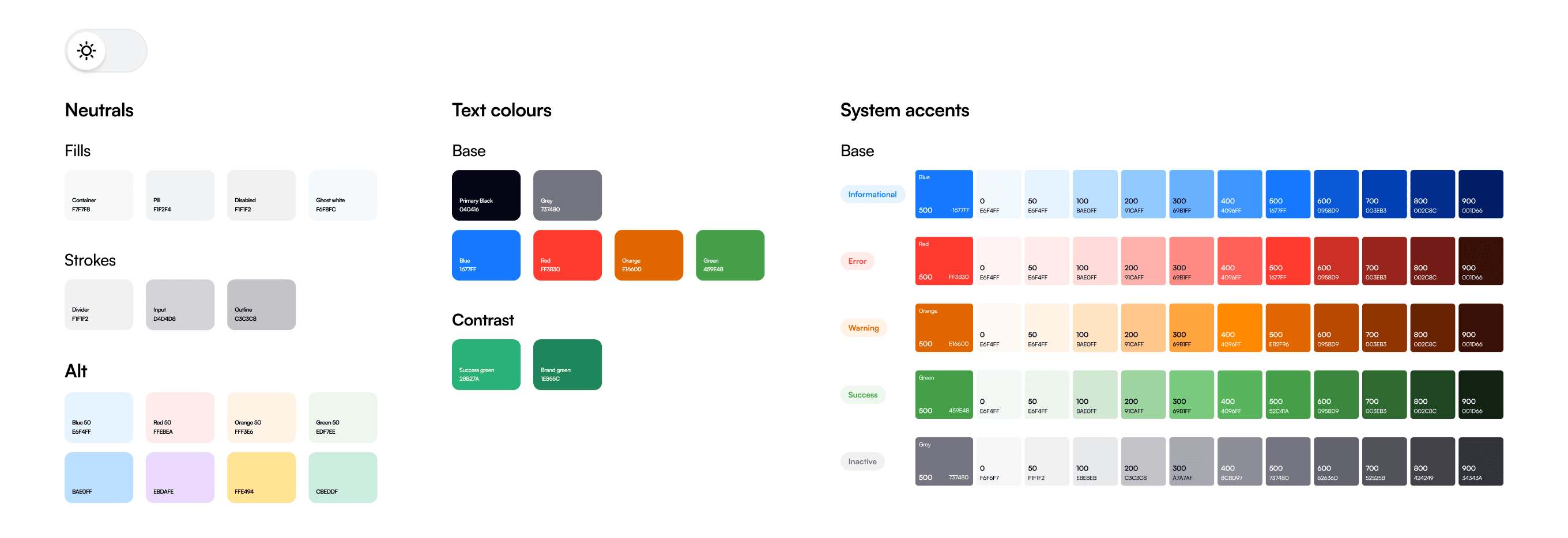
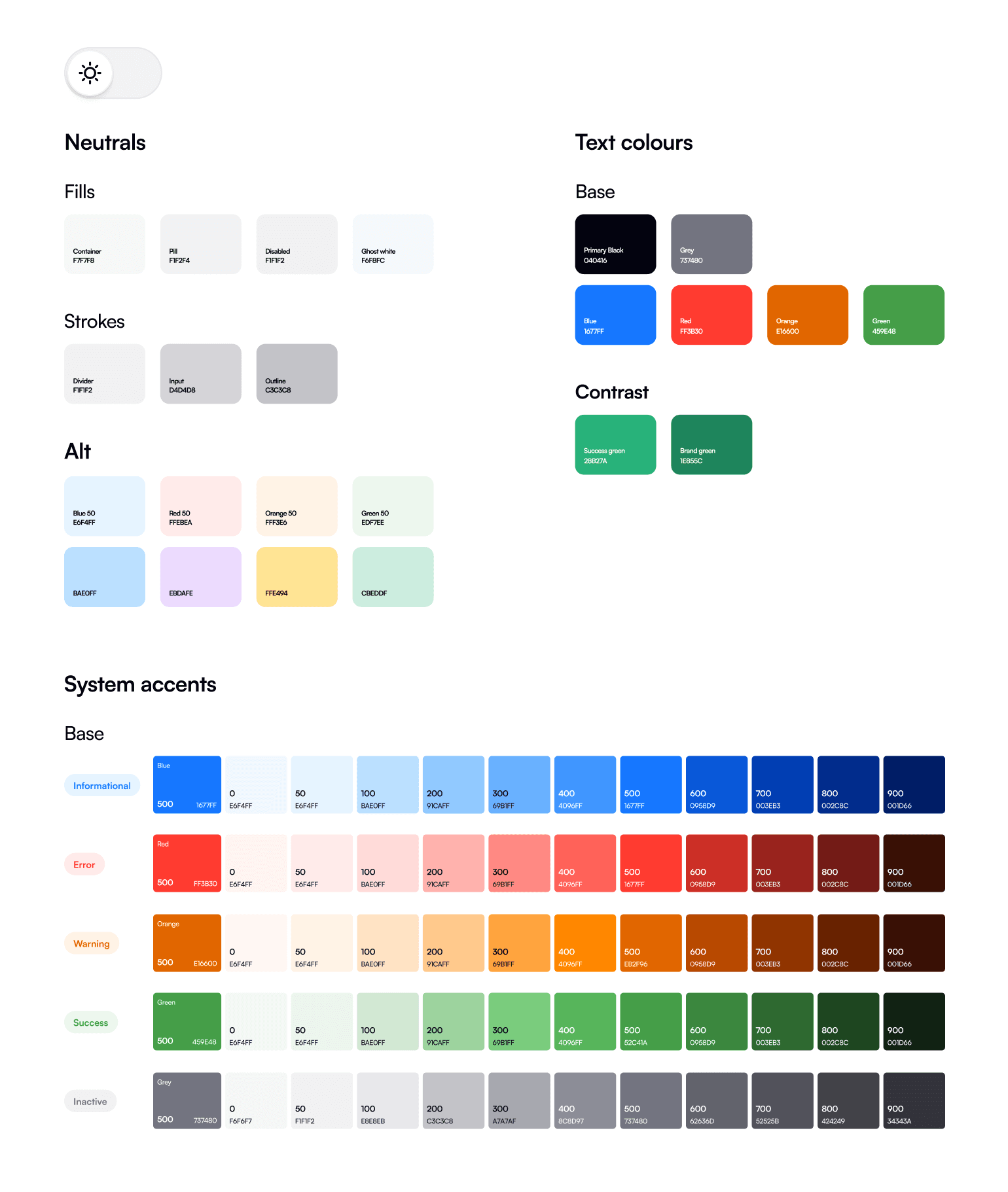
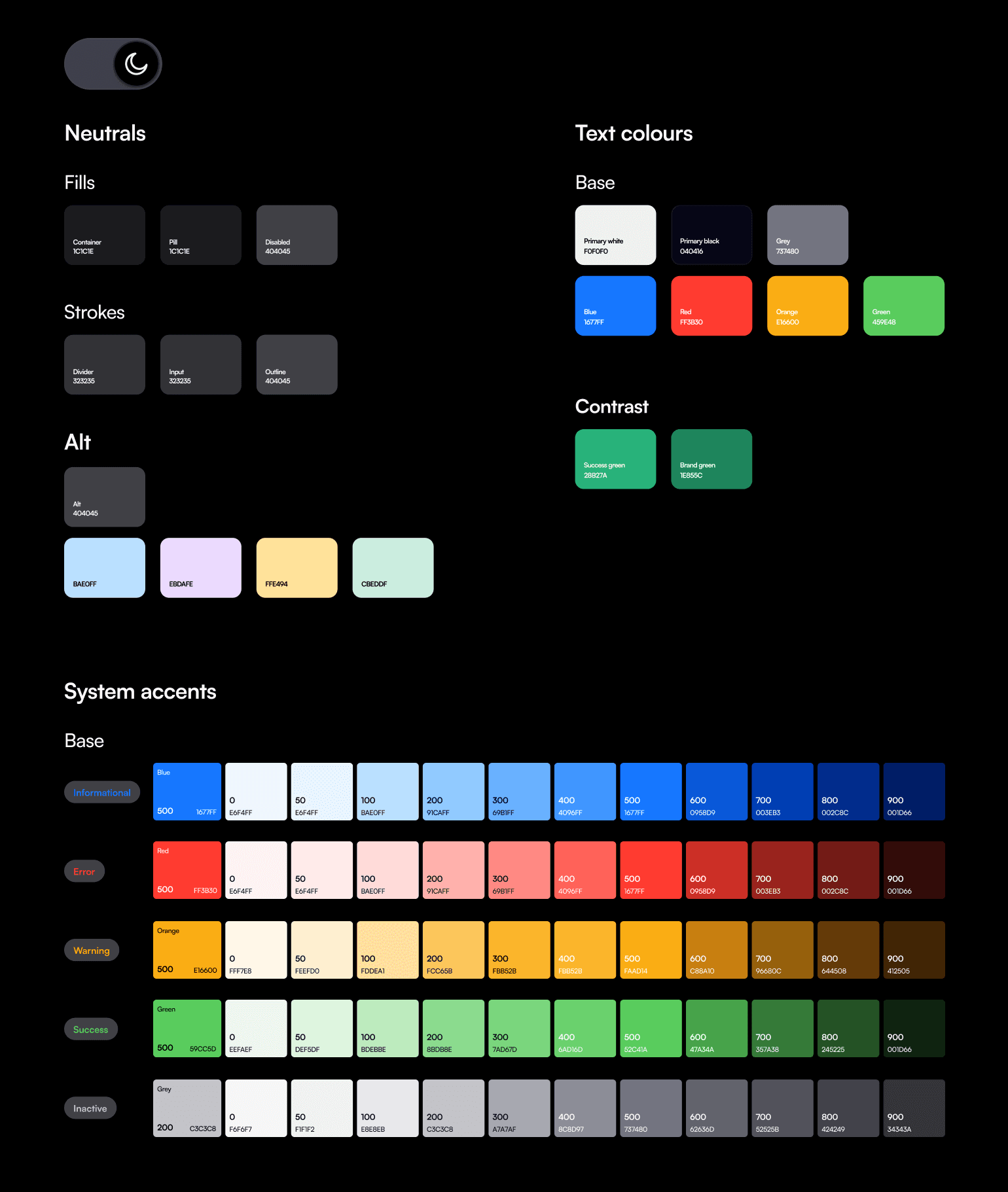
Colour palette
Borderless AI mobile app not only received a complete colour update to reflect the company's new modern, trusting, and friendly brand identity, but also:
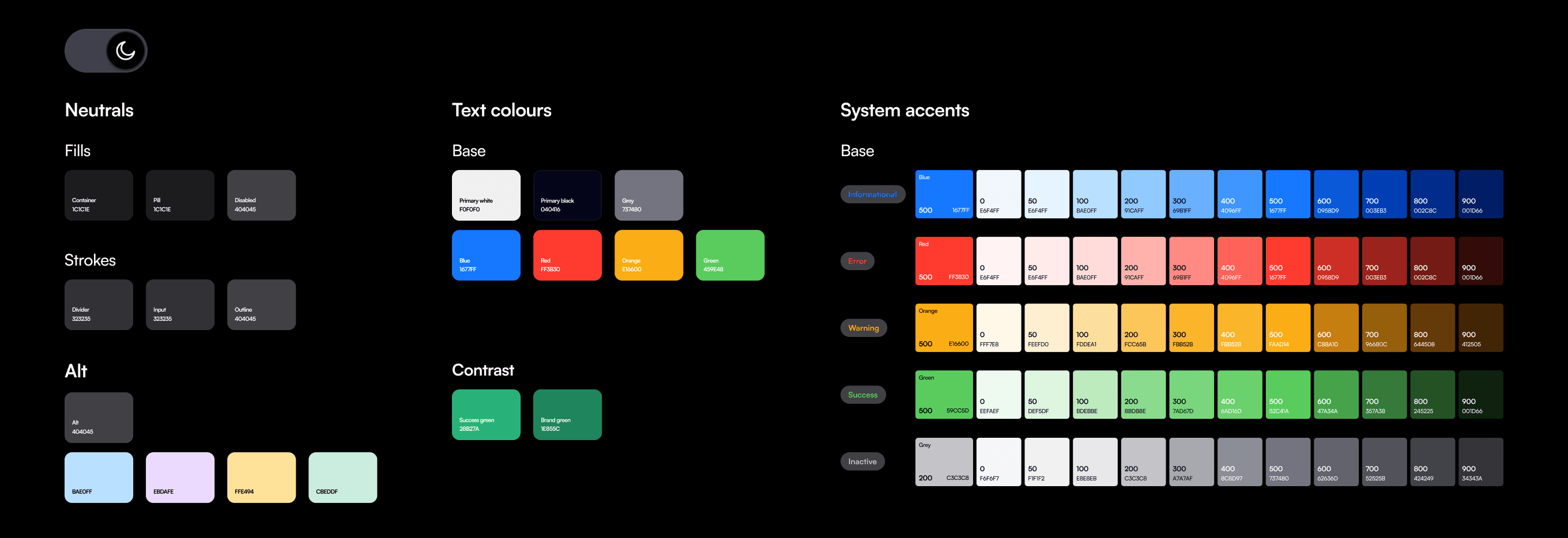
Dark mode
As part of this update, we introduced a dark mode feature, enhancing user experience and accessibility
Flutter’s colour theming set
To streamline the colour theming process, we implemented Flutter’s library code the right way this time, making it easier for developers to update colour themes efficiently.
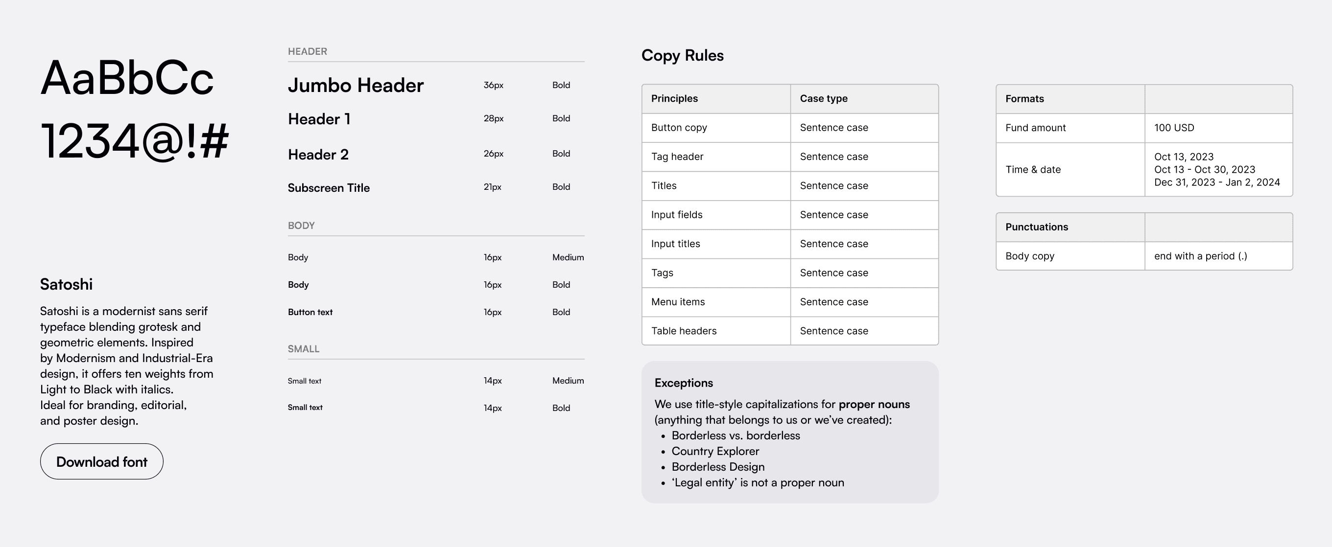
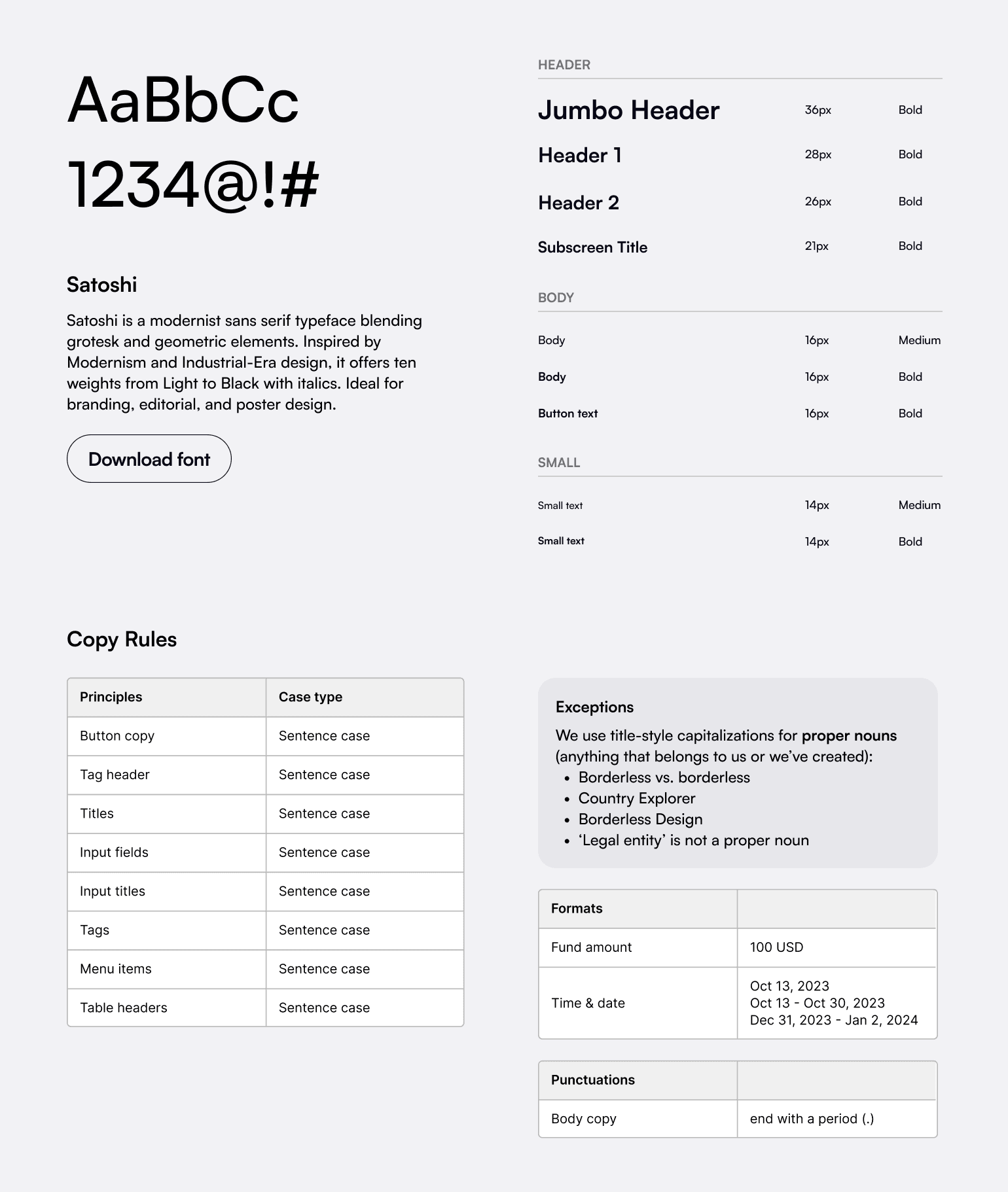
Typography
In addition to expanding the typography library to give designers more flexibility, we implemented copy rule guidelines to reinforce the company's tone.
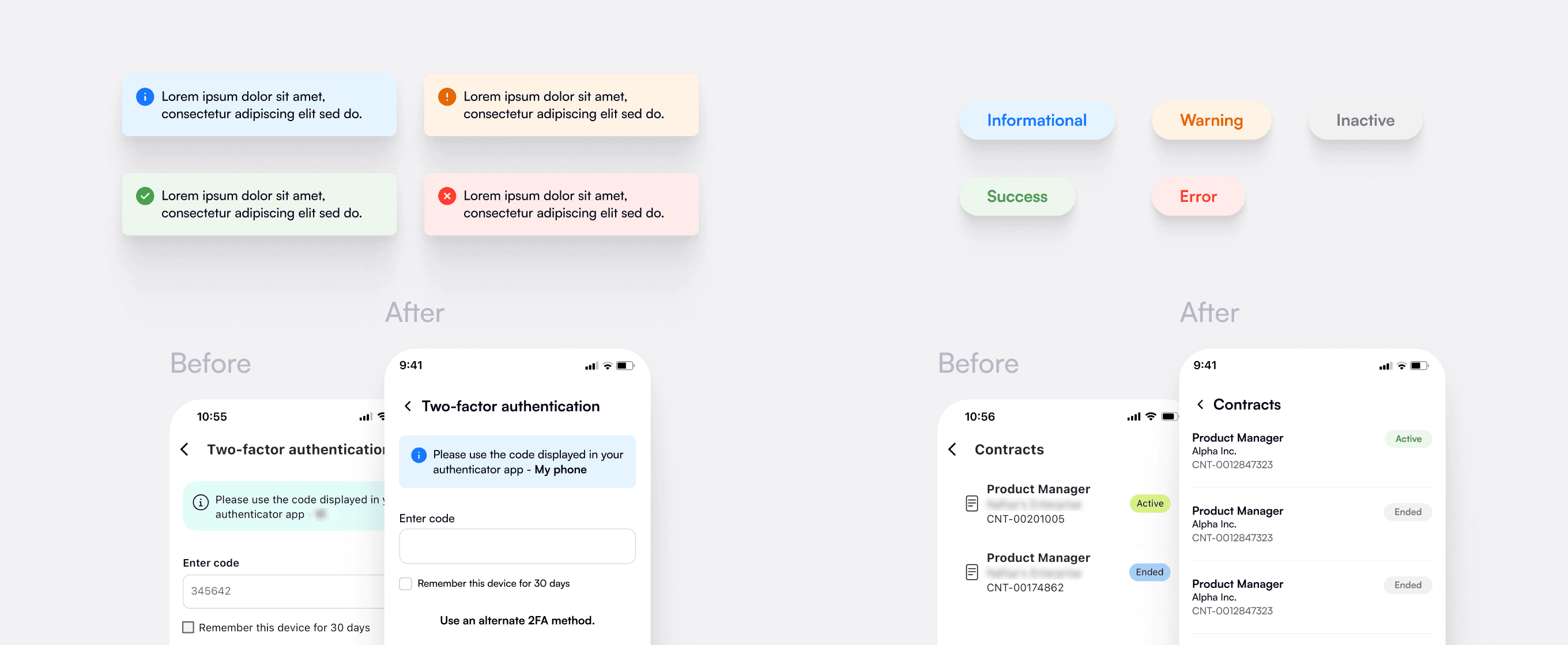
Statuses & alerts
Previously, Borderless AI status and alerts were functional but lacked visual clarity. The new updates use consistent colour themes and clear distinctions to help users understand the importance of each message.
Variants
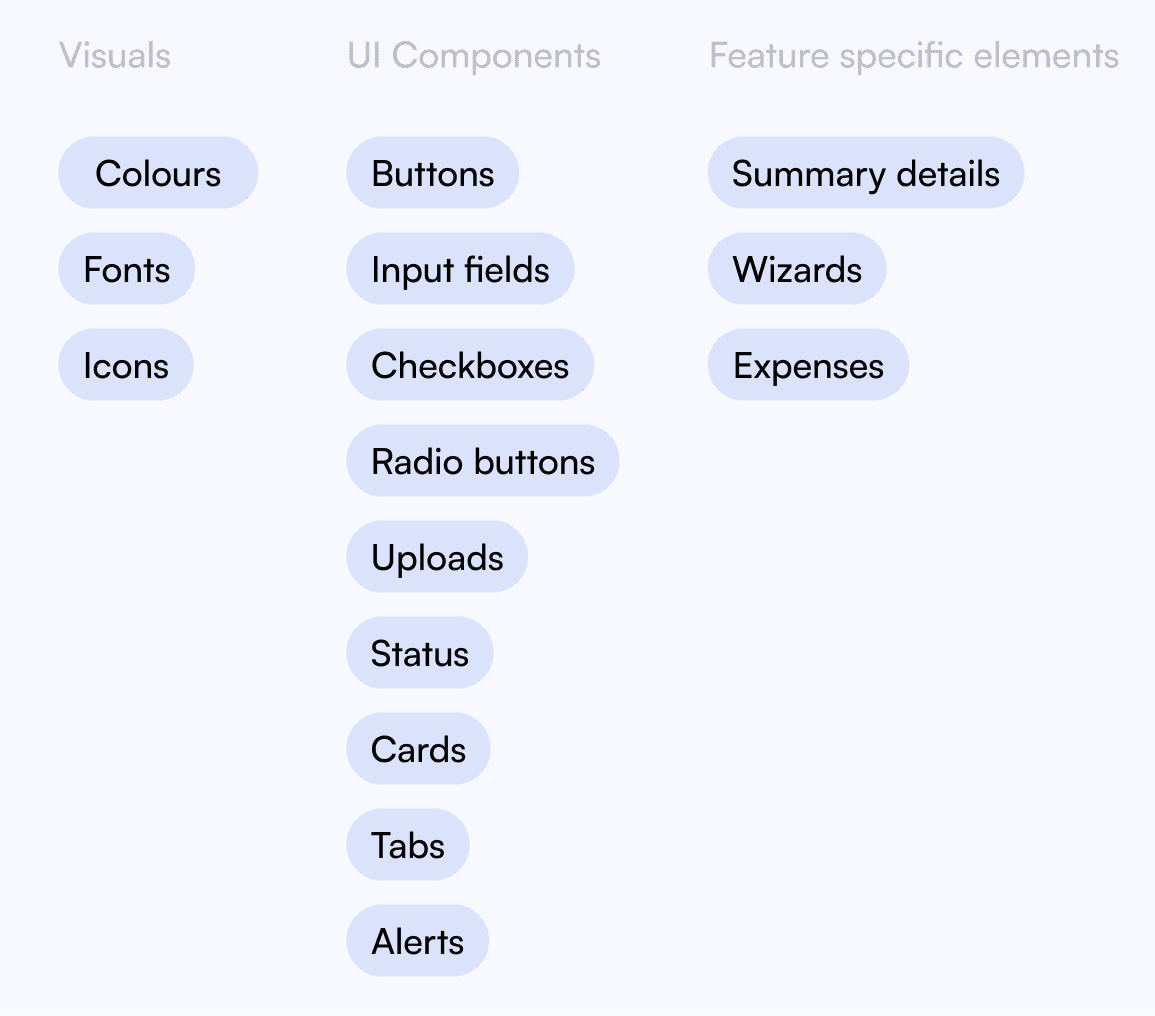
The remaining components, along with their variants and states, were either updated or added to bring the design system fully up to date. With this comprehensive system in place, the team now has a single source of truth, streamlining workflows and enhancing collaboration.
The new design system was met with positive feedback from both the mobile development and product teams. Additionally, we received comments from 85% of surveyed users who found the new changes more intuitive and user-friendly, resulting in a 15% increase in overall customer satisfaction, according to our customer service team.
While this project is still in progress, overall the entire team felt more aligned, reducing assumptions and streamlining the overall process.
Wins
•
Centralized resource: A single source of truth for the team to reference their build
•
Efficiency gains: Less time spent on design and development
•
Streamlined colour theming: A cleaner colour code library for future changes efficiency
•
Enhanced brand identity: Strengthened Borderless AI's brand identity through cohesive design and consistency
